All Precision Instrument Sales

A Better Presentation
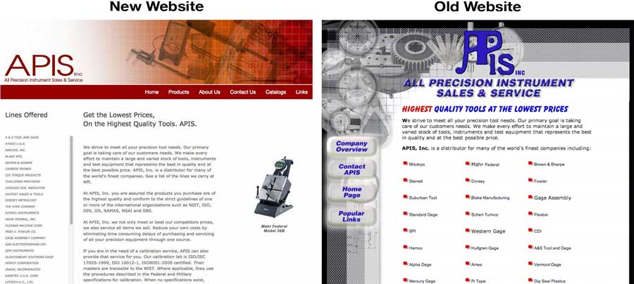
This dramatic before-and-after example shows how important good web design is to creating a good user experience.
It’s no secret that website visitors judge the quality of a website – and its usefulness – based on looks alone within the first few seconds of landing on a home page.
Visitors to a poorly designed site will quickly leave if they determine that the site isn’t user-friendly or doesn’t quickly deliver the information they’re looking for.
This company, who sells and services precision instruments, knew that they needed to swap their tired, old website for a more up-to-date site that better served their customers.
The client’s objectives for their website redesign were to:
- improve the look and feel of their site
- more effectively deliver information about the brands they sell
- have an easy way for their customers to request catalogs
What We Did
With a crisp new logo, striking color palette and improved content structure, this site was dramatically transformed from an old, outdated website into a clean, streamlined, user-friendly website.
For this project, creating an effective way to display content was at the top of our list. The client’s old website already had usable content which was a plus. The key was to restructure and reorganize that existing content to engage web visitors and make finding information easier.
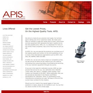
To better organize and display the content on the home page, we condensed product lines into a scrollable alphabetical listing in the left sidebar, and we added a slideshow of product images to the right sidebar.
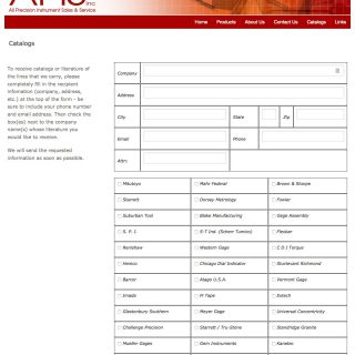
One of the main features of this site is a customized contact form with checkboxes where web visitors can submit requests for product catalogs by manufacturer.
The contact form provides two important benefits to the client:
- It drastically reduces the burden on office staff who previously had to handle time-consuming phone requests.
- It serves as an effective lead-capture tool for the company’s sales and marketing efforts.
Website Page Images
Click on a thumbnail to see a larger image and/or begin a slideshow.
To website gallery »

