Philip D. O’Neill, International Arbitrator
 Working on complex legal cases around the world, this international arbitrator needed a website that accurately conveyed the gravity of his work and effectively presented his extensive experience and expertise.
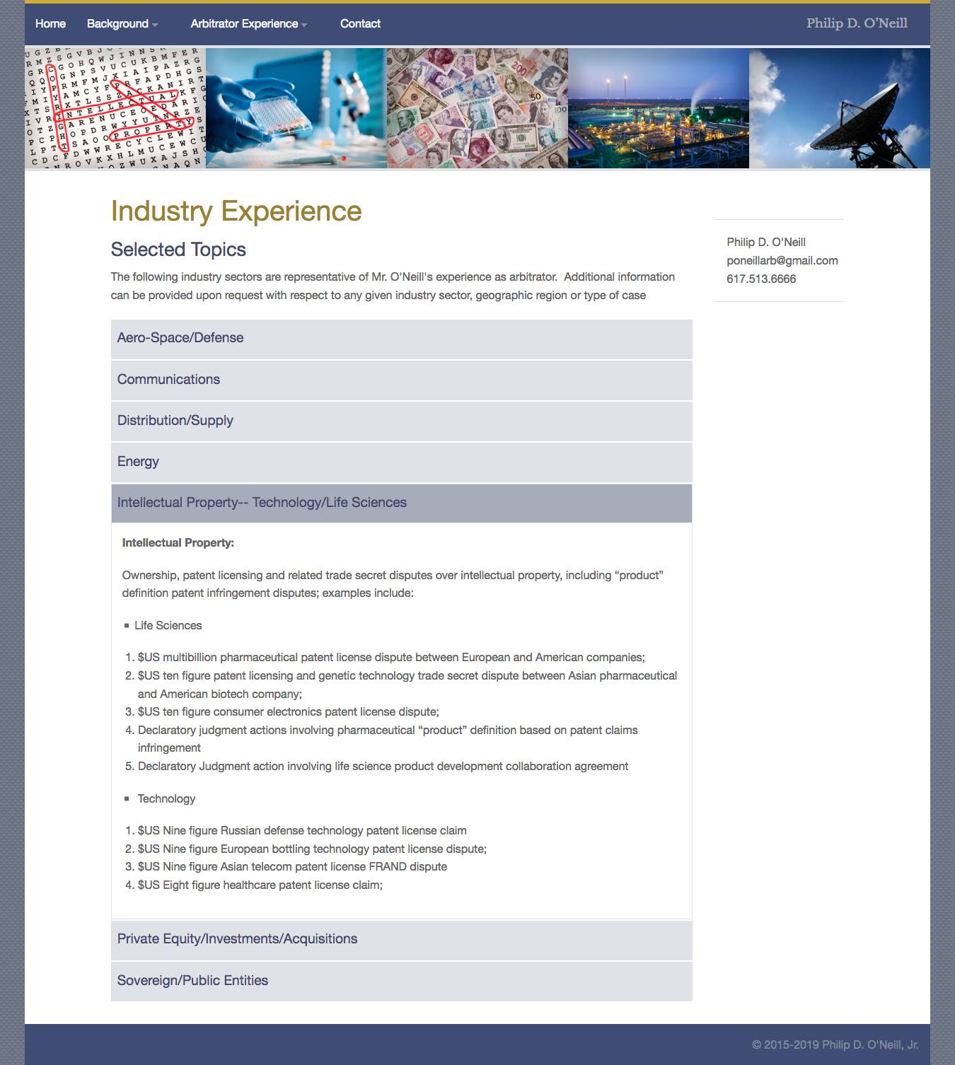
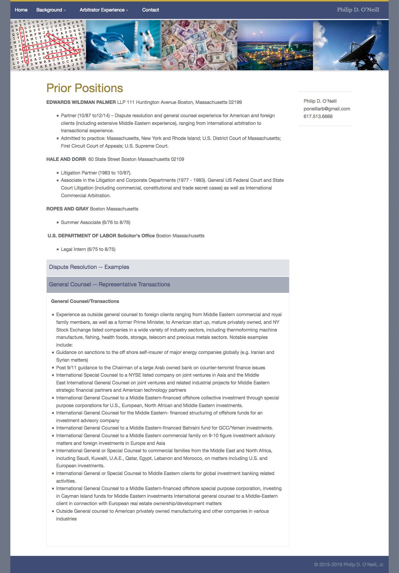
Our client had a large amount of information he needed to communicate on his website. Our challenge was how to make his large amounts of text manageable and discoverable. Many legal websites suffer from “walls-of-text” syndrome. The problem is that walls-of-text make it very hard to quickly find information. Relevant information is buried deep, is difficult to discover and is not scannable. This quickly becomes very tedious for web visitors.
What We Did
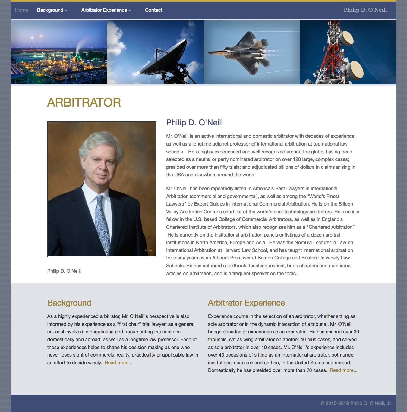
To avoid large walls-of-text on this website, we organized our client’s written content into easily digestible, single-topic web pages. We placed much of the content within accordion panels, each having a descriptive header indicating the content contained in each panel. The result is clean, scannable web pages that provide a smooth, streamlined user experience.
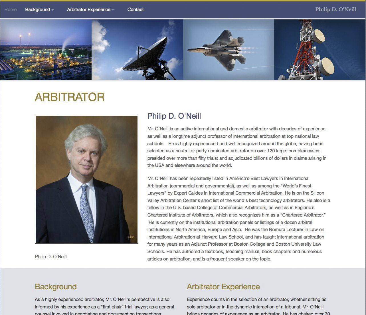
The intended audience for this website is government and corporate lawyers. Our client arbitrates multi-billion dollar cases, so his site must present as professional, serious and dignified. For the color palette, we chose blue because it evokes trust, dependability and quality, and gray because it evokes balance, logic and neutrality — all desirable attributes for arbitrators.
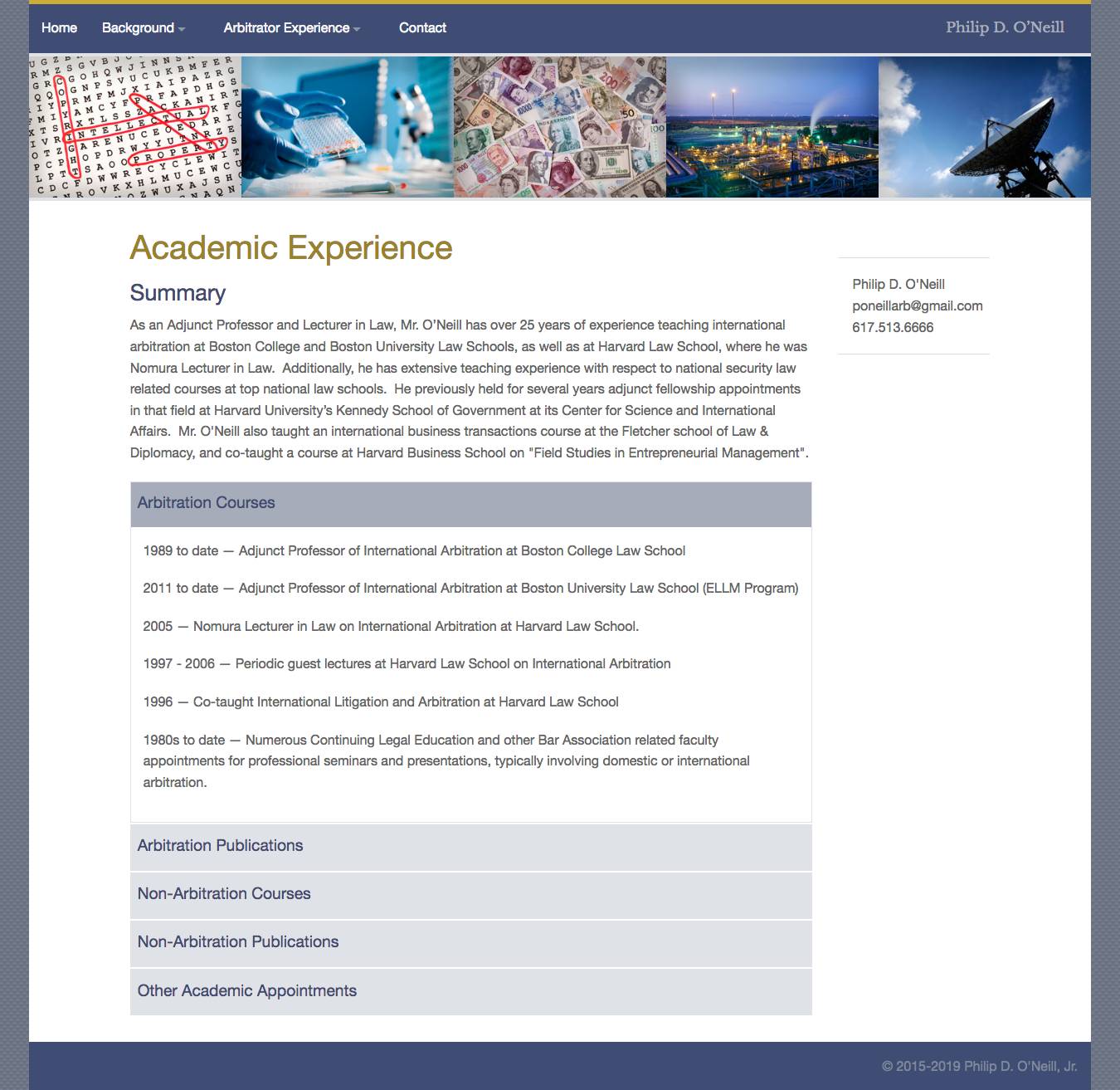
This responsive website uses our proprietary CMS. For the home page, we created a responsive sliding banner that automatically displays up to five images across on desktop computers and reduces to a minimum of two images on mobile phones. The banner images quickly communicate to website visitors our client’s areas of expertise and industries served.
Website Page Images
Click on a thumbnail to see a larger image and/or begin a slideshow.